Tuesday, 16 March 2010

Critical Reflection


After completing my project I created a questionnaire where my audience could give me feedback on how they thought the final magazine pages looked. From this I concluded that on average they gave the magazine a 7 out of 10, they liked the way the front cover contrasts the double page spread and something they disliked was that it was mainly female orientated. Therefore if I was to make this magazine again I would include more images of male artists as my primary audience is predominantly male.


The three images on the left show my final magazine front cover, contents page and double page spread. Throughout the production stage I developed my Photshop skills as previously I had only ever used it for graphic design. From my initial front cover layouts I designed I think my final cover hasn't changed that much which is one thing that I think worked out well. If I was to do this project again I think I would organise the photoshoot better as I didn't have an SLR camera which compromised the quality of my final photo's. As you can see from the image I have kept to the conventions of a music magazine such as a big splash image on the front cover, the use of plugs and the colour of the font which is a mixture of black, white and red. From my research feedback just over the majority of my audience said that the front cover would encourage them to buy the magazine however the ones who said it wouldn't said this because they didnt think the image stood out enough and didn't catch their eye.


From my initial ideas and contents layout the final contents page has changed slightly as another image has been placed on the left hand side. I did this last minute so had to re-size the font and re-arrange the page slightly. I stuck to the layout I designed originally and included the website at the bottom as a way of advertising it within the magazine. This is the page out of all three that I am most happiest with as its simple and easy to read and I like the typography, images and colours used however if I was to do this project again I would list more articles for the magazine and probably add another image.


This is my final double page spread which is exactly the same as I planned it which is something im happy with. There wasn't enough room for me to fit my whole double page spread article I wrote on the left hand side of the page so I had to select certain questions to include. From my audience feedback questionnaire I was able to find that they criticised the double page spread for not having enough content evne though I struggled to fit in as much as I did, but some of the audience did say that they thought what content was there was easy to read and enagaging. If I were to make this page again I would either use a smaller font or change the style of article so I could fit more of it in which would appeal to the audience greatly.
Overall, throughout the magazine project I feel as if my skills have developed and improved greatly. I had to overcome many obstacles in the construction process such as the skin looking too airbrushed and once the red eye had been removed it made the models eyes look unnatural. Once completing the task it made me realise how important and influential audience research is as without it you could end up choosing things to include in your magazine which you wouldn't appeal to your target market. So if I were to do this again I would probably create more questionnaires or another mood board so I had more audience research to work from. Another thing I would do would be to challenge the conventions of music magazines as it would give my magazine an advantage above others as it would include something different and unexpected. When it comes to the final pages I really wasn't happy with the front cover as I don't think it looks professional enough and could be improved greatly by changing a few things such as the font styles. I was quite pleased with the contents page overall but on the double page spread I would have liked to have been able to include more content from the article I had previously written but there wasn't enough room on the page. Therefore if I were to complete these pages over again I would make those changes as it would improve the look of the whole magazine.

Monday, 15 March 2010

Pre Production


The moodboard was a clear and quick way to show my audience through images. It helped to see what the interests and likes are of my target market which would eventually help me when making decisions on what to include in my final magazine.


This is an image from my scrapbook showing a selection of images from my photoshoot that I am going to use and some that I will reject. It was useful to take many images, even though not all of them would be used it gave me more of a variety to choose from and there were many reasons why I reject a certain amount such as they were too close up or the expression wasn't right.


This is an image of my primary and secondary audience. My primary audience consists of males aged 18-25, who are students and have many musical interests, the secondary audience will be females of a similar age and with similar interests. Defining my target audience meant I could create values for the magazine and aim it at certain social groups.


The psychological profile highlighted one person who would be in my target audience and listed their interests. I think it has conformed to the stereotype of someone who is interested in Indie/Alternative music as you could say their interests such as going to see live music and shopping in vintage shops are what you would expect.


These are my initial font ideas for my masthead, I annotated what I liked and disliked so when looking back and making a decision it could be made easily. In the end I chose a masthead that wasn't in the list as I found one that I thought was the most appropriate for my magazine. This was one of the only think I didn't use audience research for but if I were to this again I probably would so I would have an idea of what my audience what want.


Here is a list of my initial name ideas for my magazine and in the column next to them I have
written the connotations and why that particular name would appeal to my target audience. After I had done this I gave it out to 20 people and got audience feedback on what name they
preferred and why which helped on deciding the final name for the magazine.


This is a image of a page from my scrapbook displaying the conventions of a music magazine in terms of language, straps, typography, colour, plugs, sections, images, splash, layout and price. I did a spider diagram so it would show my ideas clearly and therefore I would be able to choose which conventions to apply to my final magazine easily.


To create my contents layout ideas I looked at examples from NME ( https://blogger.googleusercontent.com/img/b/R29vZ2xl/AVvXsEhU3ivC8QFfCHil-6q41zRrClYZ1FpZYG-oZLjCYl5IUmboKrB99JoGHrujl06ja3ZDX2dYMpXAX7A0tA1JBQoW7WSnl77SoBeEuLsUv-hCMr8bf6YKEPLO3m2QfMNK2-F_BddsqtEYFJc0/s320/nme+contents+page.bmp ) and from my deconstructions to help me decide on the placement of images etc. I designed two different layouts and then chose the top one for my final magazine. I had to think about if the layout would be simple and easy to read when drawing it out.


To help me design my double page spread layouts I looked at my deconstructions and examples from other magazines such as Kerrang and NME which is who my magazine was heavily inspired by. When designing these layouts I had to make sure that I took in to account the masthead, subheading, quotations from the article, the article and the main images.


The first thing we had to do for the pre-production stage was complete two deconstructions for a front cover, contents page and a double page spread. By doing this it helped me to be able to identify the conventions used which would eventually help me when deciding what to select for my magazine. On the deconstructions I annotated everything from the use of image, typography, colour, layout and the plugs used as it was a good way of seeing what magazine readers expect and they were something to model our own magazines on. From these deconstructions the conventions I used in my final magazine were the use red, black and white which were common in most of the magazines, the layouts and plugs used. I think it is important to feature the conventions as it is a way of guaranteeing, if done correctly, that it will appeal to your target audience, however it is just as important to challenge these conventions which I should've done to improve my final magazine as it shows your magazine to be different from others and gives it a unique selling point therefore if i was to do this project again this is something that I would take into account.

Preliminary Task


After conducting a questionnaire, I concluded the results which helped me to decide what to include in my college magazine for example which masthead and articles and also to define my target audience. It also highlighted how important audience research would be for my final magazine project.


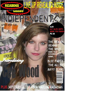
Here is my final front cover for my college magazine for the preliminary task. To create this I compiled a questionnaire and a summary of results with analysis to make sure it would appeal to my target audience. It also helped me to practice and develop my basic Photoshop skills that I had when starting the course.

Throughout the preliminary task I used packages such a Photoshop and InDesign of which I have only ever used briefly. It gave me a better idea of how to use both programs for when I would have to use them for my final magazine pages. The photoshoot that we did was useful as I had never used an SLR camera before and knew that the pictures would have to be of a high quality for the production stage. I faced a few challenges during the making of the college magazine as even though it was a simple task I have very few skills in Photoshop so a lot of explaining was necessary. For example I was taught how to use layers and duplicate them, add effects to the typography, crop out the background behind the image you want to use and how to blend the hair colour into any part of the background that was tricky to remove. The use of image and getting that image was easy as I used a girl from my class and the school help set up the photoshoots for us with a professional SLR camera. Since completing the preliminary task, I think my planning skills have improved as in my evaluation I said that I didn't plan for this task properly where as for the main magazine project I did which kept me on track and organised so I would be able to hand everything in on time. I think the preliminary task helped me to know where I had to improve to make my final magazine pages better as I decided I would complete more audience research and note down their feedback as a way of making sure the magazine would appeal to them therefore I think my evaluative and research skills have been improved throughout the year. Finally, I think my construction skills have also been developed as for this task I had only basic knowledge of how to use all of the programs required but when it came to the final project I could use what I had learnt and build on that so my final magazine pages could be of a better standard and look more professional.